Extras Richest and poorest households

There are 1.5 million households in New Zealand. Here's what they earn
There are 1.5 million households in New Zealand. Here's what they earn


Last updated: 07/11/2015

Recommended stories

The latest Herald data blog post is by Chris McDowall. He is currently working on a project to visualise New Zealand through maps and infographics funded by Creative New Zealand.
In 2013, the Census of Population and Dwellings recorded that there were just over 1.5 million households in New Zealand. This map consists of confidential and anonymous representations of these dwellings as a single dot, coloured according to its annual combined household income.
#####Regarding Privacy Concerns
Statistics New Zealand does not release data that might reveal the details of specific households and individuals. Survey responses get combined with those of people who live in the same neighbourhood and reported as statistical averages.
Consequently, the dots on this map do not represent the actual locations of people's houses but an approximation.
For urban areas the dots are randomly placed within city blocks. In rural areas they are sprinkled across area units that may occupy several kilometers. - - -
The intention of the map is to convey a sense of the shape of the nation's population and the distribution and geographic texture of household income.
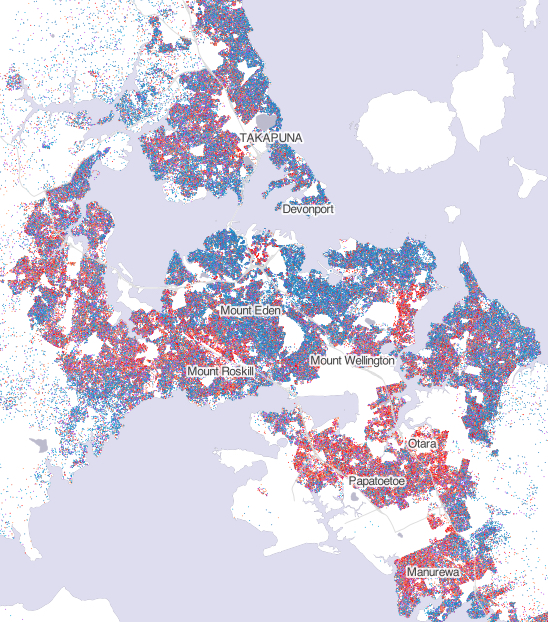
Viewing Auckland at a regional level reveals familiar patterns. The North Shore appears relatively affluent, although incomes are highest on the coast and to the east of the motorway.
The central isthmus is a blue sweep through Saint Heliers, Remuera, Mount Eden, Ponsonby, Mount Albert and out to Point Chevalier. An enclave of low income households in Tamaki and Glen Innes stand out in red along the banks of the estuary.
Manukau demonstrates a diverse range of incomes, although suburbs like Otara, Mangere and Otahuhu are strongly dominated by households earning less than $50,000 per year. Waitakere is a heterogeneous mix of diverse neighbourhoods.
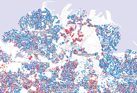
Zooming in on any one location yields more detail. For example, the affluent neighbourhoods of Ponsonby, Grey Lynn, Newmarket and Parnell surround pockets of red low-income housing, presumably tertiary students in the Central City.
The maps extend beyond Auckland to cover all of mainland New Zealand. When you read these maps ask yourself questions about the texture and geography of New Zealand.
Which places are relatively homogeneous?
Where do people of different income groups live in close proximity?
How does income distribution in urban New Zealand differ from the provinces?
#####Background
Statistics New Zealand does not release data that might reveal the details or identities of specific households and individuals. Instead, survey responses get combined with those of people who live in the same neighbourhood and reported as summed totals (e.g. total population) or statistical averages (e.g. average income). Consequently, the dots on this map do not represent the actual precise locations of people's houses but an approximation.
The most fine-grained geographic unit that Statistics NZ releases data about is called a meshblock. Meshblock sizes and shapes vary but typically "meshblocks in rural areas have a population of around 60 people, while in urban areas meshblocks are roughly the size of city blocks and contain approximately 110 people". To further ensure anonymity, values reported at meshblock level are randomly rounded up or down to the nearest multiple of three.
For every meshblock, the Census data reports how many households fall into the following bands. $20,000 or less $20,001 to $30,000 $30,001 to $50,000 $50,001 to $70,000 $70,001 to $100,000 $100,001 or more.
Constructing this map involved writing computer software to count the number of households reported within each band and positioning them randomly within the spatial boundary of each Census meshblock. The reader is encouraged to read this map as a statistical approximation rather than as a literal depiction of survey results.
Chris McDowall (@fogonwater) is a geographer and data scientist. He is currently working on a project to visualise New Zealand through maps and infographics funded by Creative New Zealand.