People How population has changed in New Zealand

Mapping the population shift in New Zealand young adults and the general population between 2001 and 2013
Mapping the population shift in New Zealand young adults and the general population between 2001 and 2013


Last updated: 08/11/2015

Recommended stories

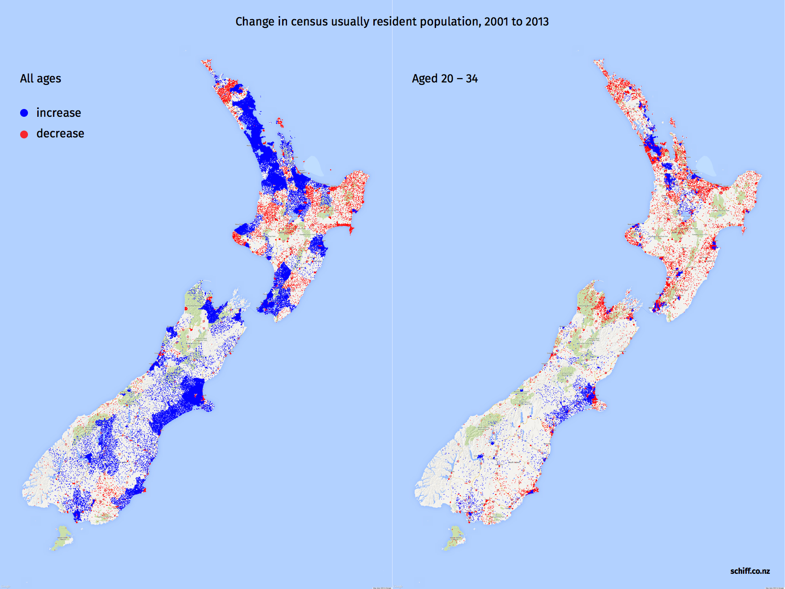
The interactive map shows population change in New Zealand between 2001 and 2013.
Earlier we published a blog post by the economist Aaron Schiff who created density dot maps - which showed one blue dot for each new person in census area units that experienced population growth over this time, and one red dot for each person lost in areas where the population shrank.
Mr Schiff had asked if anyone would like to help make an interactive map - Wellington-based data visualisation firm Dumpark produced this one over the week. It allows readers to see patterns for each city and all the rural areas.
You can select a map for all ages and for 20 to 34 age group.
For all age groups, the map shows decline in population in Northland, Gisborne and parts of lower North Island.
Mr Schiff commenting on the interactive noted that it showed big population increases in cities (especially city centres), offsetting the rural declines, also there are lots of rural areas where population increased.
Mr Schiff's original graphic is presented below.